
Customize
You can easily customize the look and feel of the Command Palette using the options prop. This prop accepts a CommandPaletteOptions object, which allows you to style every part of the palette — container, input field, items, categories, and more.
The component is designed with inline style overrides in mind, meaning you can directly inject CSSProperties objects to change visuals without touching CSS files.
Options Structure
type CommandPaletteOptions = {
  containerStyle?: CSSProperties;
  containerInputFieldStyle?: CSSProperties;
  inputFieldStyle?: CSSProperties;
  listStyle?: CSSProperties;
  overlayStyle?: CSSProperties;

  itemStyle?: CSSProperties;
  itemHoverStyle?: CSSProperties;
  itemActiveStyle?: CSSProperties;
  categoryItemStyle?: CSSProperties;
  highlightStyle?: CSSProperties;

  closeOnSelect?: boolean;
  maxResults?: number;
  fuzzySearch?: {
    threshold?: number;
    minMatchCharLength?: number;
  };
  emptyState?: ReactNode | ((query: string) => ReactNode);

  listScrollbar?: {
    width?: number | string;
    thumbColor?: string;
    thumbHoverColor?: string;
    trackColor?: string;
  };

  animations?: {
    enabled?: boolean;
    durationMs?: number;
    easing?: string;
  };

  enableHistory?: boolean;
  maxHistorySize?: number;

  helper?: {
    text: string;
    keys: string[];
    description: string;
    style?: CSSProperties;
    keyStyle?: CSSProperties;
  }[];
};
Skeleton
Example Usage
You can pass your customization directly through the options prop of the CommandPaletteProvider.
import { CommandPaletteProvider, SHORTCUTS } from "@mattis44/react-command-palette";
import SearchIcon from "./SearchIcon";

const customOptions = {
  containerStyle: {
    backgroundColor: "#0d1117",
    border: "1px solid #30363d",
    borderRadius: "12px",
    padding: "1rem",
  },
  containerInputFieldStyle: {
    borderBottom: "1px solid #30363d",
    padding: "0.5rem 1rem",
  },
  inputFieldStyle: {
    color: "#fff",
    fontSize: "1rem",
    outline: "none",
  },
  itemStyle: {
    padding: "0.75rem 1rem",
    borderRadius: "8px",
    cursor: "pointer",
  },
  categoryItemStyle: {
    fontSize: "0.75rem",
    color: "#aaa",
    padding: "0.25rem 1rem",
    textTransform: "uppercase",
  },
  helper: [
    {
      text: "Press",
      keys: ["Enter"],
      description: "to run a command",
      style: { color: "#999", fontSize: "0.85rem" },
      keyStyle: {
        backgroundColor: "#1f6feb",
        color: "white",
        borderRadius: "4px",
        padding: "2px 6px",
      },
    },
  ],
};

export default function App() {
  return (
    <CommandPaletteProvider
      shortcut={SHORTCUTS.COMMAND}
      commands={[
        { id: "1", label: "Say Hello", category: "General", action: () => alert("Hello!") },
      ]}
      options={customOptions}
    >
      <button onClick={() => console.log("Open with ⌘+K or Ctrl+K")}>Open Palette</button>
    </CommandPaletteProvider>
  );
}
Customizable Sections
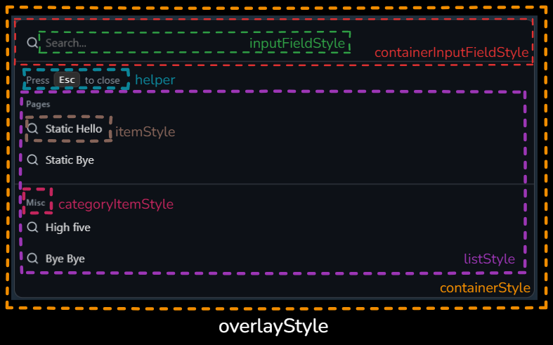
| Option | Description |
|---|---|
containerStyle | Styles the main wrapper of the command palette (center dialog). |
containerInputFieldStyle | Styles the header containing the search input and icons. |
inputFieldStyle | Directly styles the text input (placeholder, font, colors). |
listStyle | Styles the list container that holds all commands. |
itemStyle | Base style for each command item. |
itemHoverStyle | Style applied when hovering an item. |
itemActiveStyle | Style applied when an item is active/selected. |
categoryItemStyle | Styles the category headers shown before each command group. |
highlightStyle | Style applied to <mark> highlights in matched text. |
overlayStyle | Styles the background overlay behind the palette. |
closeOnSelect | Whether the palette closes after running a command (default: true). |
enableHistory | Store recently executed commands and surface them when the query is empty. |
maxHistorySize | Maximum recent commands kept (default: 8). |
maxResults | Limit how many results are shown after filtering. |
fuzzySearch.threshold | Tune fuzzy matching strictness (lower = stricter). |
fuzzySearch.minMatchCharLength | Minimum characters required for a match. |
emptyState | Custom empty content or (query) => ReactNode when nothing matches. |
listScrollbar.* | Width/thumb/track colours for the list scrollbar via CSS vars. |
animations.* | Enable/disable and tune open/close animation duration + easing. |
helper | Helper hints under the input (text + key badges). |
Example Result
With the example above, your palette will:
Use a dark GitHub-like theme.
Show a helper under the input: “Press ⏎ to run a command”.
Render items with rounded corners and soft spacing.
Use a styled input with white text and no borders.
Bundle size tips
- Default imports pull the base CSS automatically. If you want to control when CSS is loaded, swap to the lean entry and import styles once in your app shell:
import "@mattis44/react-command-palette/style.css";
import { CommandPaletteProvider, useApiRef } from "@mattis44/react-command-palette/core";- For tree-shaken hook usage without UI code, import directly from the hooks entry:
import { useCommandPalette, useApiRef } from "@mattis44/react-command-palette/hooks";- Keep inline overrides minimal and prefer CSS (variables or your own stylesheet) for shared styling to reduce repeated inline objects.
Highlighting matches
Matched characters are wrapped in <mark> tags. Override them with highlightStyle:
options={{
  highlightStyle: { background: "transparent", color: "#7c3aed", fontWeight: 700 },
}}
When fuzzy search is disabled, highlighting falls back to a simple substring match.
Animations
Open/close animations are on by default. Tune or disable them:
options={{
  animations: {
    enabled: true,
    durationMs: 220,
    easing: "cubic-bezier(0.22, 1, 0.36, 1)",
  },
}}
Set enabled: false for instant rendering (handy in tests or perf-sensitive flows).
Custom empty state
Provide a node or a function that receives the current query:
options={{
  emptyState: (query) => (
    <div style={{ padding: "1rem" }}>
      No matches for <strong>{query || "your search"}</strong>. Try shorter keywords.
    </div>
  ),
}}
If omitted, the palette shows a default message that includes the current query.
Keeping the palette open after selecting a command
By default the palette closes immediately after executing a command. If you need to run multiple actions in a row — for example when building a bulk-selection workflow — you can disable this behaviour with the closeOnSelect option.
<CommandPaletteProvider
  commands={commands}
  options={{
    closeOnSelect: false,
  }}
>
  {children}
</CommandPaletteProvider>
When closeOnSelect is set to false, the command palette will remain visible after a command runs, allowing the user to trigger additional actions without reopening it.
CSS variables
The default stylesheet exposes several CSS variables that you can override globally to match your brand colours. Add them to your global CSS (or within a theme provider) and the palette will pick them up automatically.
:root {
  --bg-color: #111827;
  --border-color: #1f2937;
  --fg-color: #f9fafb;
  --hover-bg: rgba(59, 130, 246, 0.12);
  --kbd-bg: #1f2937;
  --kbd-color: #f9fafb;
  --placeholder-color: #9ca3af;
}
Use media queries (e.g. prefers-color-scheme) or class-based scoping to offer light/dark themes.